Embed a Banner or Checklist
Unlimited banner embeds are included in all plans. Unlimited checklist embeds are available to Pro and Enterprise customers.
There are two types of content that can be embedded in your app: banners and checklists. When you embed content in your app, you can choose where it appears (for example, at the top or bottom of the page or anchored to other elements), and you can style and resize it to blend smoothly into your app. Embeds are a great way to seamlessly integrate these elements in a way that reaches the right audience at the right place and the right time.
Table of contents
- Banner embeds
- Checklist embeds
- Creating an embed
- Customizing the banner embed
- Embed settings
- Embed styling
- Tracking the user experience
Banner embeds
Use banners for in-app communications to announce updates, new features, scheduled downtime, or special events directly within your app. 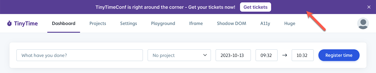
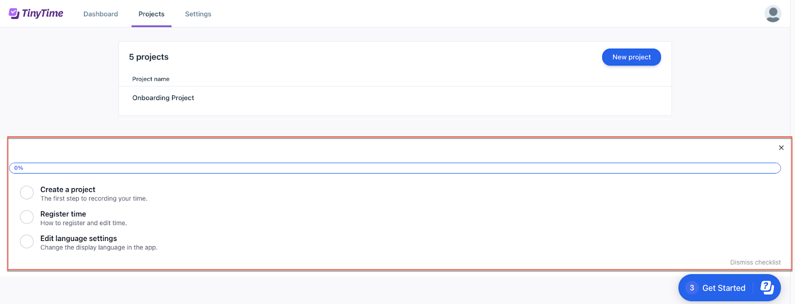
Checklist embeds
You can embed a checklist to seamlessly integrate it with your app, providing always-on, contextual guidance. An embedded checklist displays visual progress that motivates users by showing completion across tasks or onboarding flows, without needing to navigate to different places or widgets in your app.
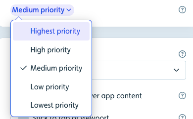
Only one checklist can be embedded on a page at a time. However, a checklist may appear on multiple pages. If a user matches the criteria for multiple checklists, the one with the highest priority will be shown until the user completes or dismisses it.
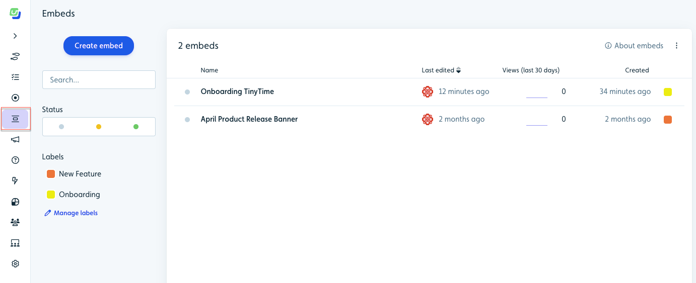
Creating an embed
-
Select Embed elements from the sidebar.
-
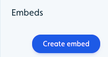
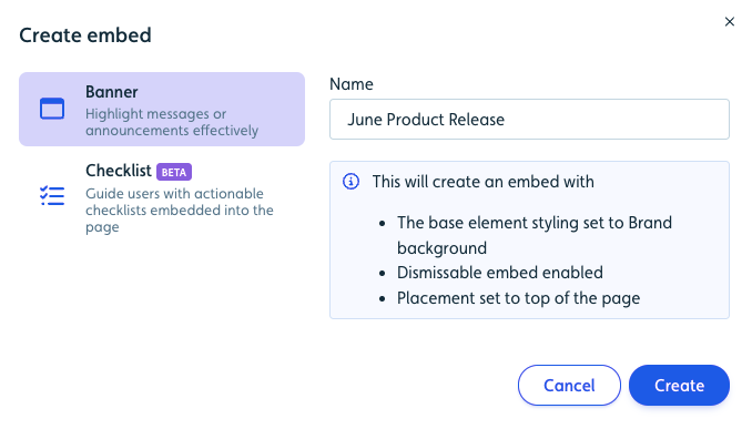
Click Create embed.
-
Select Banner or Checklist, enter a name, and click Create.
- Continue with the customization instructions below for the embed type selected.
Customizing the banner embed
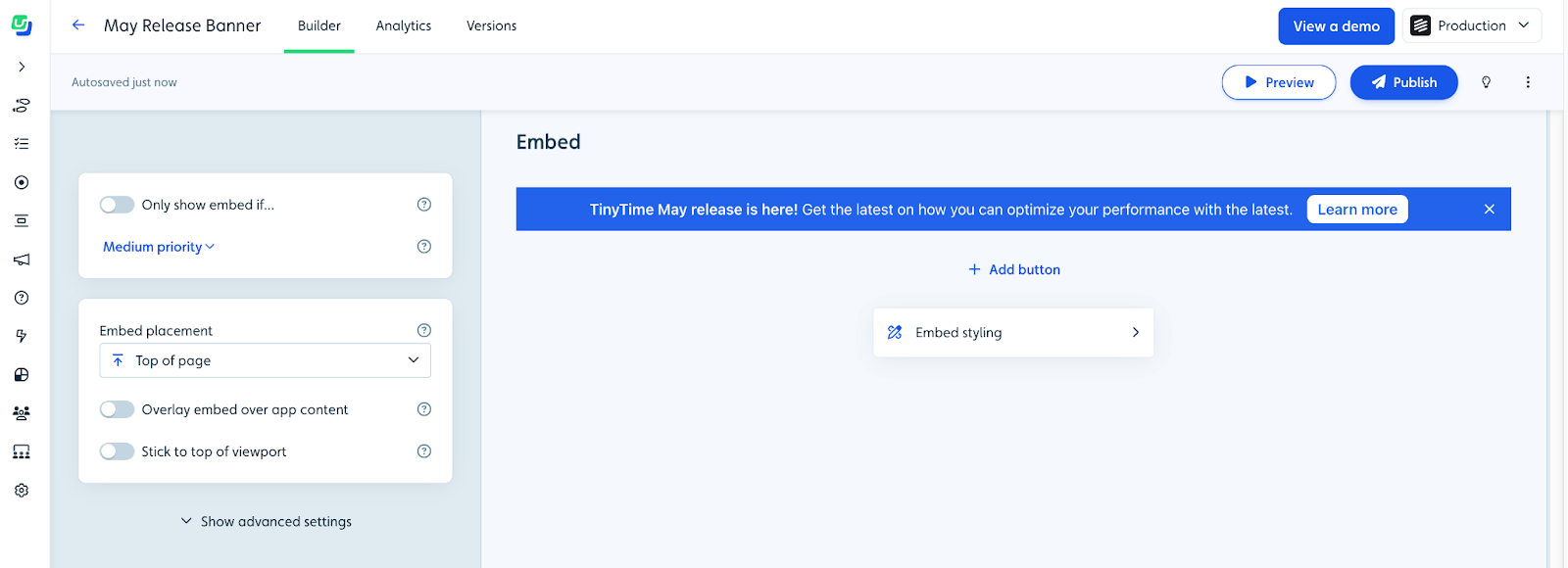
- Enter your message directly in the banner on the right.
- (Optional) Click Add button below the banner to enhance your banner with one or more buttons as a call-to-action (CTA). See the Add or edit a button section below for details.
- Configure the settings on the left to set the conditions and placement of the embed in your app. See the Embed settings section below for details.
- Click Publish.
Add or edit a button in a banner
One or more buttons can be added to a banner and linked to various sources, such as an app page, webinar registration, blog post, or a flow. Buttons can help drive conversions and lead users to take action.
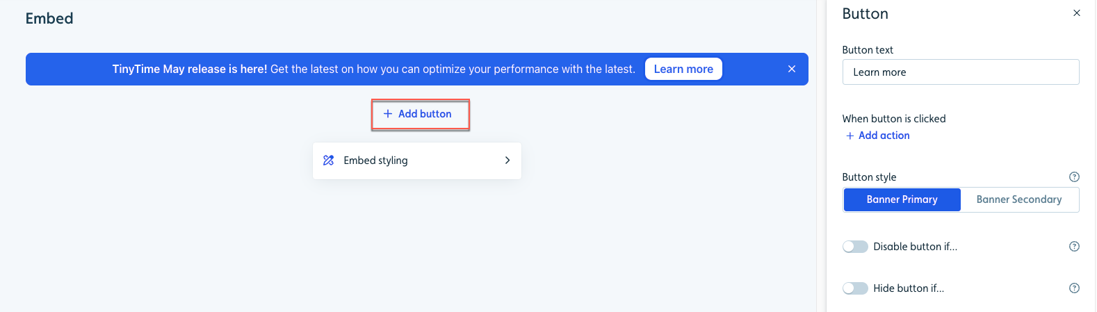
- Click Add button or edit the embed and click the button to view its options.
- Enter the button text. Keep it brief!
-
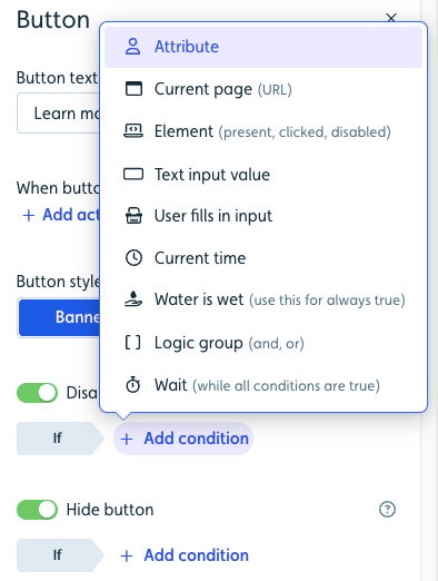
Add an action that will be triggered when the button is clicked.
Track event: Applies an event tracker to a button.
Dismiss banner: Dismisses the banner.
Start new flow/checklist: Starts a flow/checklist you designate.
Navigate to page: Navigates the user to the page you specify with a URL (in the same tab or a new tab).
Set user attribute: Sets an attribute to the value you specify. If it is a number attribute, it can also be an incrementing value.
Evaluate JavaScript: Runs JavaScript code. For example, you can trigger an action in your application. - Select the button style (Primary or Secondary).
-
(Optional) Set conditions to disable or hide each button. These targeting options let you display specific buttons to users based on their behavior, current context, or individual attributes, giving you complete control over when and how buttons appear.
Embed settings
You have the ultimate control over when and how embeds will appear for your users based on conditions and priority, events, segments, placement in your app, and how they can interact with them.
Setting conditions
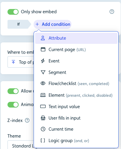
For both embed types, you need to set the conditions that must be met for a user to be eligible to see the embed. Use the toggle switch to activate the Only show embed on and add one or more conditions.
Managing multiple banner priority settings
At any given time, a user will see only one banner. If a user is eligible to see multiple banners, the one with the highest priority displays first. As a banner gets dismissed, the banner next in priority will appear.
Embed placement
A wide range of placement options are available to ensure embeds appear seamlessly in your app.
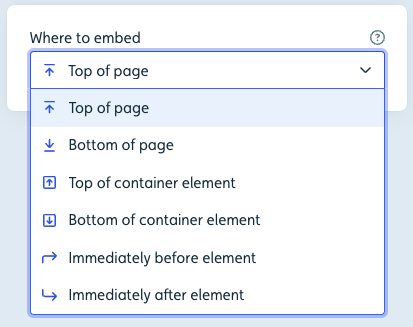
- Top of page/Bottom of page: Inserts the banner at the top or bottom of your app.
- Top/Bottom of container element: Inserts the banner at the above or below a selected container element, handy for apps with potential overlay issues like navigation menus.
- Immediately before/after element: Inserts the banner right before or after your selected element.
(Banner only) Set additional placement adjustments:
- Overlay banner over app content: For the banner to overlay your app’s content without occupying space. If disabled, the embed will appear where it’s inserted into your app and push your own app’s content. If enabled, the embed will be positioned where placed and overlay your app content.
- Stick to top/bottom of viewport: Forces the banner to stick to the top or bottom of the viewport (visible space on the screen), as the user scrolls. If disabled, the embed will scroll out of view when the user scrolls past it.
Advanced settings
Under Show advanced settings, you can control the following settings.
- Allow users to dismiss embed: Decide whether users can permanently dismiss the banner with an X button. Without this, it willl require a button with a dismiss banner action.
- Animate when embed appears: Let the banner emerge with a subtle animation or simply pop into view.
- Z-index: Defines how high the banner should appear on top of other elements in your app. By default, it’s placed very high, and probably above all your app’s own elements. If the banner is supposed to appear under a dialog from your own app, you can try to set the z-index to a lower value.
- Theme: Select a theme to guide the banner’s overall look.
Embed styling
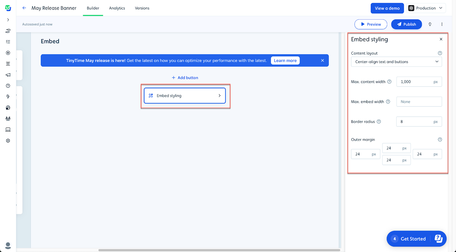
In the styling block for either embed type, you can manage visual style that may vary from embed to embed:
- Content layout: (Banner only) Determine text and button alignment.
- Max. content width: Synchronize embed width with your app’s content for visual coherence.
- Border radius: Opt for rounded corners when the banner doesn’t touch viewport/container edges.
- Outer margin: Control the spacing between the banner and adjacent app elements.
The embed’s background and text colors are automatically generated from your brand/main colors by default. You can override these with specific embed colors in the theme designer.
Tracking the user experience
User activity for banners and checklists can be found in the Analtics tab for each.
Banner:
- Banner Seen: The banner was displayed to the user in your app.
- Banner Dismissed: The banner was seen and dismissed by the user.
Checklist:
- View detailed analytics in the Analytics section for each checklist.