Banners
Use banners to announce updates, new features, scheduled downtimes, or special events directly within your app.

Table of contents
- Building a banner
- User experience with Banners
- Multiple banners
- Banner placement
- Banner styling
- Advanced settings
Building a banner
- Open the Userflow app and navigate to Banners.
- Click on Create banner.
- Type your desired message. All our regular formatting options are at your disposal.
- Enhance your banner with a button to serve as a call-to-action (CTA). This could link to an app page, open a blog post in a new tab, or start a flow.
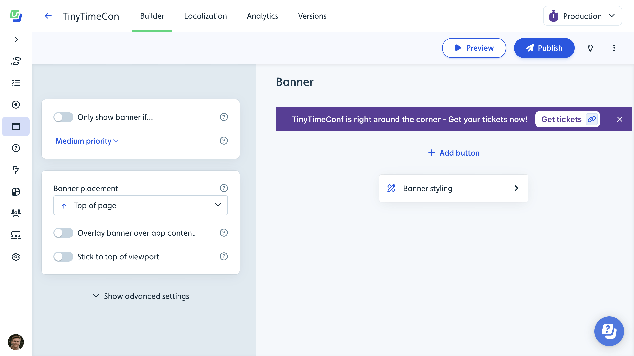
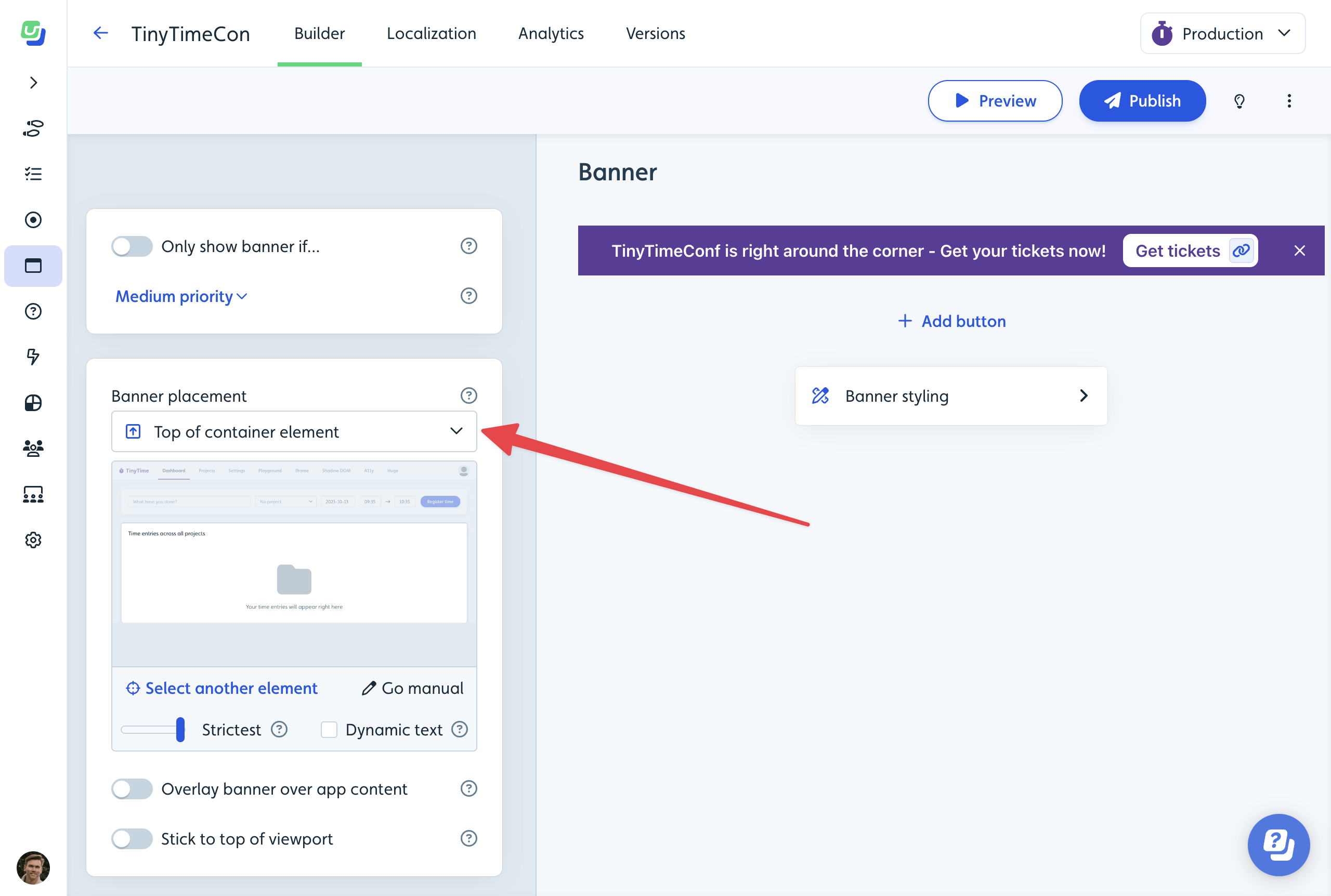
- Define the banner’s position with the Banner placement feature. From embedding it across the page to integrating it within specific app elements for a native feel, the choice is yours. See Banner placement for more details.
- To further customize, tweak the banner’s layout, dimensions, and more in Banner styling.
- Use Only show banner if to narrow down its visibility to certain users or specific pages.
- Once satisfied, click Publish.

User experience with Banners
Once a user matches the criteria and the banner displays in your app, a Banner Seen event is tracked. The banner stays visible either as long as the Only show banner if condition aligns with the user or until they dismiss it. Once dismissed by a user, that specific banner won’t be shown again. A Banner Dismissed event is tracked upon dismissal.
Multiple banners
At any given time, a user will see just one banner. If multiple banners are eligible for a user, the one with the highest set priority displays first. As one banner gets dismissed, the next in line may appear.
Banner placement
To ensure banners harmonize with your app, various placement options are available under Banner placement:
- Top of page: Inserts the banner at the top of your app.
- Bottom of page: Same as previous option, but at the bottom of the page.
- Top of container element: Inserts the banner at the start of a chosen container element, handy for apps with potential overlay issues like navigation menus.
- Bottom of container element: Same as previous option, but at the bottom of the selected container element.
- Immediately before element: Inserts the banner right before your chosen element.
- Immediately after element: Same as previous option, but right after the selected element.
Further placement adjustments include:
- Overlay banner over app content: For the banner to overlay your app’s content without occupying space.
- Stick to top/bottom of viewport: Makes the banner stick to the top (or bottom) of the viewport during user scroll.

Banner styling
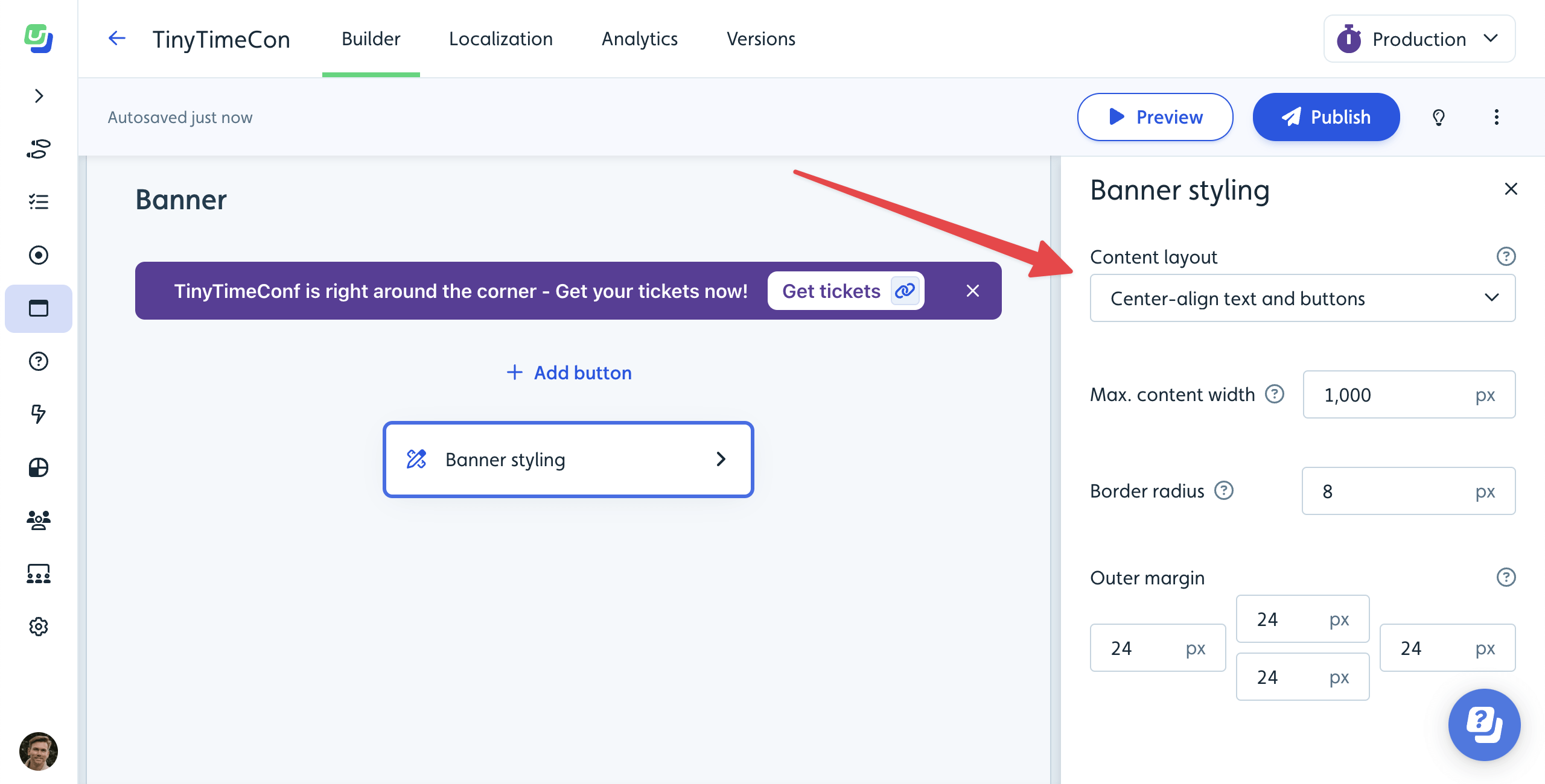
In the Banner styling block, you can manage visual style that may vary from banner to banner:
- Content layout: Determine text and button alignment.
- Max. content width: Synchronize banner width with your app’s content for visual coherence.
- Border radius: Opt for rounded corners when the banner doesn’t touch viewport/container edges.
- Outer margin: Control the spacing between the banner and adjacent app elements.
Background and text color of the banner is controlled by your theme. By default, colors are auto-generated based on your Brand/Main colors. In the theme designer, under Banners, you can also set specific Background and Text colors for banners, specifically.
While the banner’s color scheme relies on your theme, it’s derived from your default Brand/Main colors. However, in the theme designer under Banners, you can choose different background and text colors just for banners.

Advanced settings
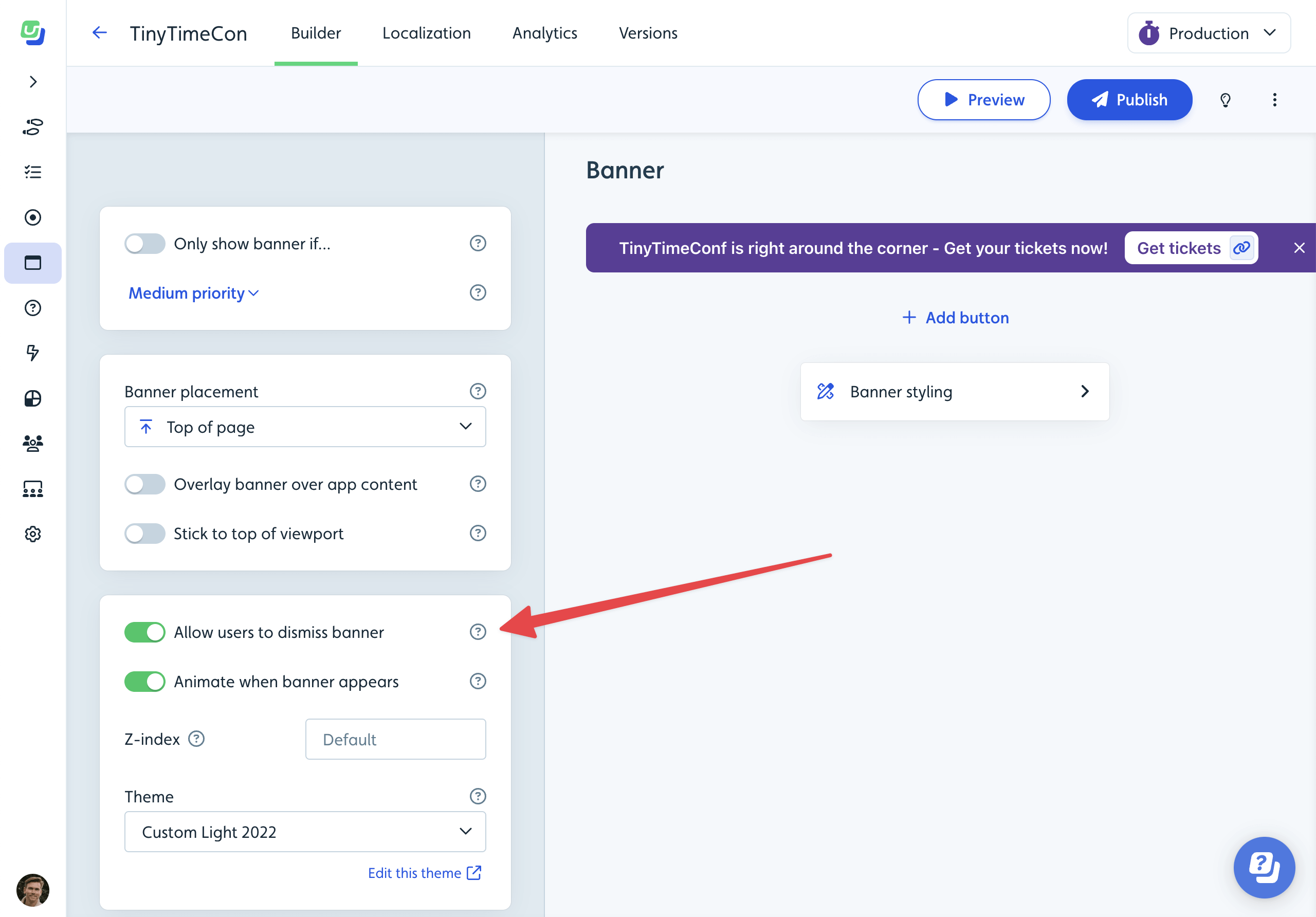
Under Show advanced settings, you can control the following settings:
- Allow users to dismiss banner: Decide whether users can permanently dismiss the banner with an X button. Without this, it’ll require a button with a Dismiss banner action.
- Animate when banner appears: Let the banner emerge with a subtle animation or simply pop into view.
- Z-index: Defines how high the banner should appear on top of other elements in your app. By default, it’s placed very high, and probably above all your app’s own elements. If the banner is supposed to appear under a dialog from your own app, you can try to set the z-index to a lower value here.
- Theme: Select a theme to guide the banner’s overall look.

